I am not a fan of photographs.
Why?
When I got fired from Broadside in 2005 for peacefully confronting the editor-in-chief about her underage drinking problem, I went to work for the George Mason University yearbook, GMView.
One minute I was a journalist and the next I was a photographer. I was not happy.
I wasn’t just a photographer. I was PR/recruiting director. I took pictures, I went to the communication reception to entice people to join the yearbook staff and I put up flyers for GMView around campus.
I loved parts of the job. I sold more yearbooks than anyone in my Yearbook Workshop class. I had fun doing that. I also loved representing the group at the communication reception–the best event at Mason, bar none. You should go to one. Then you’ll see what I mean.
Still, though, I did not want to be part of the yearbook staff. I wanted to be at Broadside.
That was a long time ago, though.
Here are the things that I learned about that from Mark Briggs and his 2013 book “journalismNEXT”:
-Briggs writes on page 147 that a picture is like a gift box. He writes there that it is information that you are giving to the reader, and, thus, you should pack it with as many details as you want them to have.
-He writes on page 150 that a picture should be a truthful representation of a situation or setting.
I agree with each of these things, but I disagree with some of the other things Briggs writes in this chapter.
I disagree, for one thing, with the notion he presents on page 155 that journalists should “Tone and color correct the picture[s] [they take].” I think that doing that violates the rule above–the one from page 150 about providing a truthful representation.
I also disagree with the idea that, as Briggs writes on page 170: “Blogs without art are lame.”
I read blogs for the words they present, but still, I will supply some images here in order to learn from you, my readers.
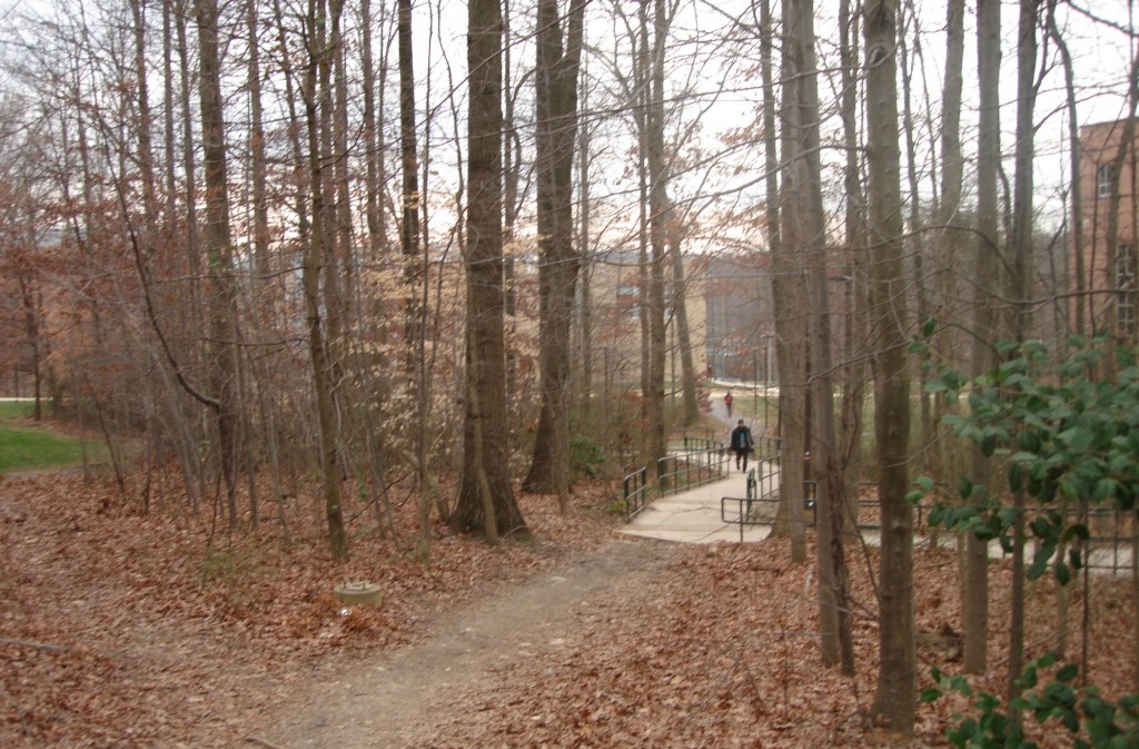
I took the image above (of the student-made path to the sidewalk next to the Johnson Center) to depict the interaction of people with the natural environment. I am focusing on sustainability, so I wanted an image that would make people think about that relationship.
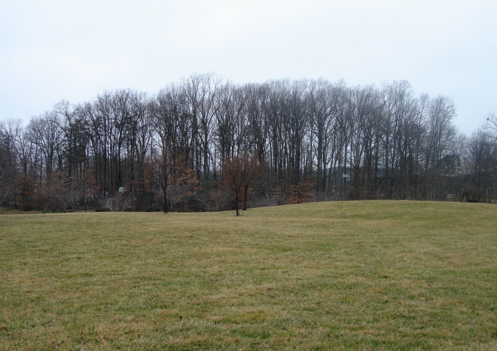
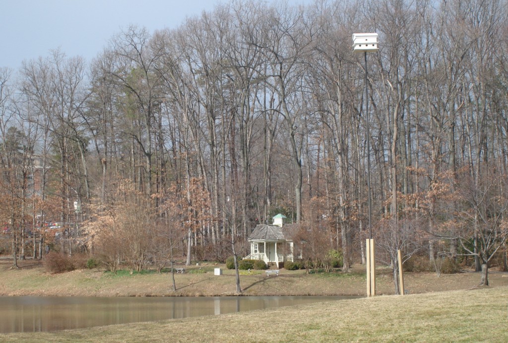
I took that image and the two below with the intention of using one of them as my blog header.
This is the grassy area by Mason Pond.
This is the gazebo beside the pond.
I settled, in the end, on the image at the top of the blog, at least for now. I will probably replace it with some flowers blooming or a collage of sustainability-themed images. Tell me what you think. This blog is for you, my readers, as much as it is for me, if not more. I aim to please and to serve. I welcome your comments.


